
A planner is more than a to-do list, for a lot of people, it’s a daily companion. That kind of relationship makes color one of the most powerful design decisions you’ll make, because color shapes how a planner feels to use, not just how it looks.
Color Shapes Mood Before a Word Is Read
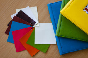
Cool blues and greens tend to feel calm and organized. They are great for wellness-focused planners. Warm corals and yellows feel energizing and motivating, they are well suited to productivity planners. Deep jewel tones read as luxurious and grounded, often used in premium lines. None of this is accidental, its design is doing its job.
Match Color to Purpose
The best planner brands pick colors that reinforce what the planner is meant to help someone do, soft, muted palettes for self-care; bold, high-contrast tones for productivity; warm, earthy shades for gratitude and reflection.
Why “Close Enough” Color Doesn’t Work
A shade of sage green that prints two tones too cool can read as clinical instead of calming, undercutting the exact feeling you designed it to create. Mood colors are precise by nature, which is why a Pantone reference (rather than a general RGB or CMYK approximation) matters so much here.
It Builds Emotional Trust With Repeat Customers
Once a customer loves your planner’s aesthetic, they expect that same feeling every time they repurchase. Precise, repeatable color protects that emotional consistency and with it, customer loyalty. Designing a planner people love isn’t just about layout and paper, it’s about protecting the feeling you designed, print run after print run.
Bringing an emotionally intentional planner design to life takes a manufacturing partner who gets the details right. Codra works from your exact Pantone specifications to make sure the mood you designed is the mood your customers feel. Contact us at sales@codra.com.