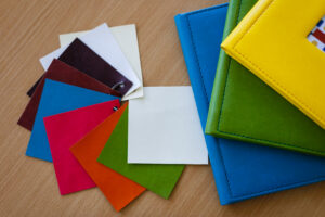

If you design planners, color is one of your biggest brand differentiators and one of the easiest places to lose money. What looks perfect on your screen can print completely different depending on the printer or paper stock. A Pantone set solves that problem, and in doing so, saves planner creators real money.
Screen Colors and Print Colors Speak Different Languages
Your monitor displays color using light (RGB); printers use pigment (CMYK or spot ink). That translation is never perfect. A Pantone set gives you a physical, standardized reference point outside of any screen, so you know exactly what a color will look like before it’s printed.
Fewer Proofs Mean Lower Costs
Every round of proofing costs money and time. Specifying a Pantone number instead of an RGB or CMYK code gives your manufacturer an exact match, which means fewer surprises, fewer proofing rounds, and lower production costs.
Consistency Across Your Whole Product Line
If your brand includes covers, stickers, dividers, and packaging, a shared Pantone reference keeps every SKU visually aligned, season after season, reprint after reprint.
Protects You When You Switch Manufacturers
As you scale, you may move production to a new manufacturer. A Pantone reference lets any professional print partner match your colors precisely, turning a risky transition into a smooth one. Color plays a significant part of your branding. Protecting it with the right tools isn’t an extra step, it’s a cost-saving strategy.
Ready to bring your planner designs to life with accurate, consistent color? Codra works directly from your Pantone references to make sure what you designed is what gets printed. Contact us at sales@codra.com.